ROOT object 
                    
                          This top level object holds all configuration information for this plugin. 
                         Required: true 
                         Default: (not specified; see any element defaults within) 


                     subscribesTo array 
                    
                          An array of plugin instance names corresponding to plugin instances which will be subscribed to by this plugin instance. 
                         Required: true 


                     subscribesTo[n] string 
                    
                          A plugin instance name (corresponding to a plugin you wish to subscribe to) or a topic published by the worker (ex. __PLUGIN_INFO__). 
                         Required: false 
                         Default: "" 


                     options object 
                    
                          Configuration options specific to this plugin.  Note that variables and expressions are generally allowed in this section. 
                         Required: true 
                         Default: (not specified; see any element defaults within) 


                     options.samplePeriod integer 
                    
                          The period in milliseconds at which we compute new values and update all charts. 
                         Required: true 
                         Default: 1000 


                     options.synchronizeChartYScales boolean 
                    
                          Whether to synchronize the y-scales for all charts.  If true, changing any chart's y-scale at run-time will force the other charts' y-scales to match. 
                         Required: true 
                         Default: false 


                     options.resizeChartsWithPanel boolean 
                    
                          Whether to resize charts proportionally when the panel is resized. 
                         Required: true 
                         Default: true 


                     options.computations object 
                    
                          Defines computations to be performed on 1. initialization, 2. on subscription data arrival, and 3. at every sample period just before graph values are reevaluated.  In general, keys in the subobjects below become variables in the VAR namespace with their corresponding values.  We call these "computation objects".  For example, {"myVar": 3, "myRand": "Float:(RAND(0, 10) + 0.5)"} defines variables accessible as @VAR{myVar} with value 3 and @VAR{myRand} with a value equal to a random number between 0.5 and 10.5.  As shown in the example, the expression language is allowed here as well. 
                         Required: true 
                         Default: (not specified; see any element defaults within) 


                     options.computations.initializations object 
                    
                          A computation object where keys are JSON paths and values can be of any type and use expressions and functions, and is computed one time when the plugin launches.  For example: { "exmapleVar1": 10, "exampleVar2": "kitty" } would make available variables @VAR{exampleVar1} with value 10 and @VAR{exampleVar2} with value "kitty". 
                         Required: true 
                         Default: {
    "exmapleVar1": 10,
    "exmapleVar2": "kitty"
}  


                     options.computations.initializations.{Valid JSON Set Path} stringnumberbooleanarrayobject 
                    
                          undefined 
                         Required: false 
                         Default: "" 


                     options.computations.subscriptions object 
                    
                          A object where top level keys are plugin instance names corresponding to subscriptions defined in the "subscribeTo" portion of this plugin's configuration, and whose values are computation objects where keys are JSON paths and values can be of any type and use expressions and functions. Under each such computation object, the corresponding subscription data is under a SUB namespace.  For example, if subscribesTo was ["Example Publisher"] and Example Publisher was some plugin which published data {"speed": 100, "distance": 1200} then the following would be a valid value here: { "Example Publisher": { "actualSpeed": "Float:( 10 * @SUB{speed} )", "actualDistance": "Float:( 10 * @SUB{distance} )" } }. 
                         Required: true 
                         Default: {
    "My Plugin Instance": {}
}  


                     options.computations.subscriptions.{Plugin Instance Name} object 
                    
                          undefined 
                         Required: false 
                         Default: (not specified; see any element defaults within) 


                     options.computations.subscriptions.{Plugin Instance Name}.{Valid JSON Set Path} stringnumberbooleanarrayobject 
                    
                          undefined 
                         Required: false 
                         Default: "" 


                     options.grid object 
                    
                          An object defining the grid in which the charts will lay out.  The layout element (a 2D array of chart ids) defines the order in which charts are rendered and the space they consume. 
                         Required: true 
                         Default: {
    "outerMargins": {
        "top": 20,
        "bottom": 20,
        "left": 20,
        "right": 20
    },
    "innerGaps": {
        "betweenRows": 20,
        "betweenColumns": 20
    },
    "layout": [
        []
    ]
}  


                     options.grid.outerMargins object 
                    
                          An object defining the margin to use around the outside of the grid.  The panel will be fitted around the grid automatically. 
                         Required: false 
                         Default: (not specified; see any element defaults within) 


                     options.grid.outerMargins.top integer 
                    
                          The margin above the grid. 
                         Required: true 
                         Default: 20 


                     options.grid.outerMargins.bottom integer 
                    
                          The margin below the grid. 
                         Required: true 
                         Default: 20 


                     options.grid.outerMargins.left integer 
                    
                          The margin to the left of the grid. 
                         Required: true 
                         Default: 20 


                     options.grid.outerMargins.right integer 
                    
                          The margin to the right of the grid. 
                         Required: true 
                         Default: 20 


                     options.grid.innerGaps object 
                    
                          The inner gap sizes which space the charts from one another. 
                         Required: false 
                         Default: (not specified; see any element defaults within) 


                     options.grid.innerGaps.betweenRows integer 
                    
                          The vertical gap in pixels to add between charts. 
                         Required: true 
                         Default: 20 


                     options.grid.innerGaps.betweenColumns integer 
                    
                          The horinzontal gap in pixels to add between charts. 
                         Required: true 
                         Default: 20 


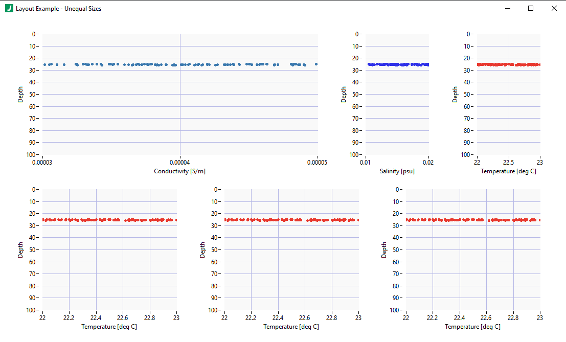
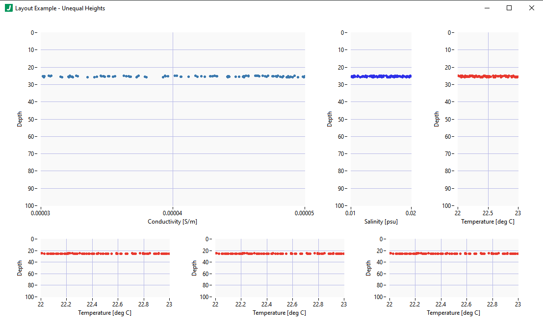
                     options.grid.layout array 
                    
                          A 2D array which defines the layout for the charts.  Charts in a given row are referenced by their ids (key names in the charts configuration object) and layed out in order according to their specified sizes (in the layout) and the specified outerMargins and innerGaps.  The tallest chart in a given row will bump down the row below it accordingly. 
                         Required: false 


                     options.grid.layout[n] array 
                    
                          An array of chart layout entries corresponding to a row. 
                         Required: false 


                     options.grid.layout[n].[n] string 
                    
                          A chart id (i.e. a key name in the charts configuration). 
                         Required: false 
                         Default: "" 


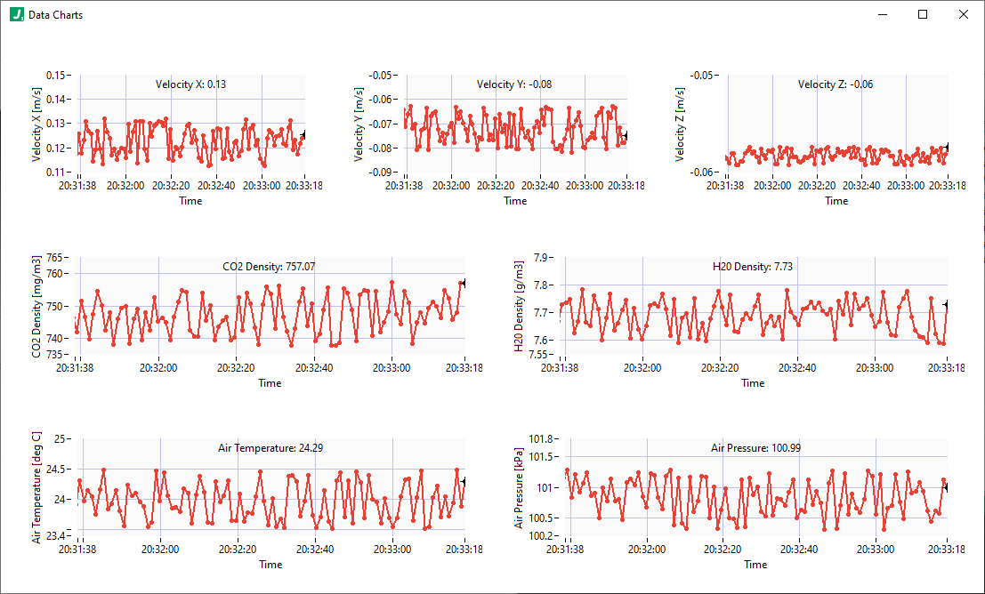
                     options.charts object 
                    
                          An object where keys are chart ids (allowed characters: letters, numbers, underscores, hyphens, and space characters) and values are chart configurations which include properties (ex. label, position, axes information, etc.) and plots (an array of plot objects).  Charts defined here will display on the user interface according to their properties AND the grid definition which determines the layout (see the grid property for more details).  This plugin currently allows up to 20 charts.  For additional charts consider using another instance of this plugin. 
                         Required: true 
                         Default: {
    "MyChart": {
        "properties": {
            "label": "",
            "xAxis": {
                "label": "Time",
                "format": "%<%H:%M:%S>T",
                "duration": 100,
                "numTicks": 10
            },
            "yAxis": {
                "label": "Value",
                "flipped": false,
                "min": 0,
                "max": 200,
                "increment": 1,
                "format": "%#.2f",
                "autoscale": "on"
            },
            "plotArea": {
                "fgColor": {
                    "r": 255,
                    "g": 255,
                    "b": 255
                },
                "bgColor": {
                    "r": 250,
                    "g": 250,
                    "b": 250
                }
            }
        },
        "plots": [
            {
                "name": "Value",
                "historyLength": 100,
                "data": {
                    "x": "Float:(@VAR{timestamp})",
                    "y": "Float:(@VAR{value})"
                },
                "properties": {
                    "visible": true,
                    "antiAlias": false,
                    "pointStyle": "circleFull",
                    "lineStyle": "solid",
                    "lineWidth": "2",
                    "fillTo": "none",
                    "interpolation": "linear",
                    "lineColor": {
                        "r": 235,
                        "g": 64,
                        "b": 52
                    },
                    "pointColor": {
                        "r": 235,
                        "g": 64,
                        "b": 52
                    }
                },
                "annotation": {
                    "enable": true,
                    "showLabel": true,
                    "showArrow": false,
                    "color": {
                        "r": 0,
                        "g": 0,
                        "b": 0
                    },
                    "pointStyle": "circleFull",
                    "pointDecoration": "dashBoth",
                    "label": {
                        "template": "Value: @PLOT{yValue}",
                        "xValueFormat": "%.2f",
                        "yValueFormat": "%.2f",
                        "anchorPosition": "TopCenter",
                        "padding": {
                            "x": 0,
                            "y": 10
                        }
                    }
                }
            }
        ]
    }
}  


                     options.charts.{Chart ID} object 
                    
                          An object definiting a chart including its properties and plots. 
                         Required: false 
                         Default: (not specified; see any element defaults within) 


                     options.charts.{Chart ID}.properties object 
                    
                          An object definiting the chart properties. 
                         Required: true 
                         Default: (not specified; see any element defaults within) 


                     options.charts.{Chart ID}.properties.label string 
                    
                          The label to display on the chart. 
                         Required: true 
                         Default: "My Plot Name" 


                     options.charts.{Chart ID}.properties.xAxis object 
                    
                          The x-axis properties. 
                         Required: true 
                         Default: {
    "label": "x-axis",
    "format": "%d",
    "flipped": false,
    "min": 0,
    "max": 10,
    "increment": 1,
    "autoscale": "on"
}  


                     options.charts.{Chart ID}.properties.xAxis::{Specify Min/Max/Autoscale} object 
                    
                          This configuration for the x-axis requires configuring label, format, flipped, min, max, increment, and autoscale. 
                         Required: false 
                         Default: (not specified; see any element defaults within) 


                     options.charts.{Chart ID}.properties.xAxis::{Specify Min/Max/Autoscale}.label string 
                    
                          The x-axis label to display. 
                         Required: true 
                         Default: "x-axis" 


                     options.charts.{Chart ID}.properties.xAxis::{Specify Min/Max/Autoscale}.flipped boolean 
                    
                          Whether to flip the x-axis (ex. if true, instead of rendering 0 on the left and 10 on the right of the x-axis, it would render 0 on the right and 10 on the left. 
                         Required: true 
                         Default: false 


                     options.charts.{Chart ID}.properties.xAxis::{Specify Min/Max/Autoscale}.min number 
                    
                          The x-axis min value. 
                         Required: true 
                         Default: 0 


                     options.charts.{Chart ID}.properties.xAxis::{Specify Min/Max/Autoscale}.max number 
                    
                          The x-axis max value. 
                         Required: true 
                         Default: 10 


                     options.charts.{Chart ID}.properties.xAxis::{Specify Min/Max/Autoscale}.increment number 
                    
                          The x-axis increment used to display x-axis tick marks. 
                         Required: true 
                         Default: 1 


                     options.charts.{Chart ID}.properties.xAxis::{Specify Min/Max/Autoscale}.autoscale enum (string) 
                    
                          Whether to autoscale the x-axis.  The value "on" autoscales on every update, "off" never autoscales, and "once" autoscales just once when data is first rendered. 
                         Required: true 
                         Default: "on" 
                         Enum Items: "on" | "off" | "once" 


                     options.charts.{Chart ID}.properties.xAxis::{Specify Duration} object 
                    
                          This configuration for the x-axis required configuring label, format, duration, and numTicks. 
                         Required: false 
                         Default: (not specified; see any element defaults within) 


                     options.charts.{Chart ID}.properties.xAxis::{Specify Duration}.label string 
                    
                          The x-axis label to display. 
                         Required: true 
                         Default: "x-axis" 


                     options.charts.{Chart ID}.properties.xAxis::{Specify Duration}.duration number 
                    
                          The time duration in seconds to display on the x-axis. 
                         Required: true 
                         Default: 0 


                     options.charts.{Chart ID}.properties.xAxis::{Specify Duration}.numTicks number 
                    
                          The number of ticks to show on the x-axis. 
                         Required: true 
                         Default: 0 


                     options.charts.{Chart ID}.properties.yAxis object 
                    
                          The y-axis properties. 
                         Required: true 
                         Default: (not specified; see any element defaults within) 


                     options.charts.{Chart ID}.properties.yAxis.label string 
                    
                          The y-axis label to display. 
                         Required: true 
                         Default: "y-axis" 


                     options.charts.{Chart ID}.properties.yAxis.flipped boolean 
                    
                          Whether to flip the y-axis (ex. if true, instead of rendering 0 on the bottom and 10 on the top of the y-axis, it would render 0 on the top and 10 on the bottom. 
                         Required: true 
                         Default: false 


                     options.charts.{Chart ID}.properties.yAxis.min number 
                    
                          The y-axis min value. 
                         Required: true 
                         Default: 0 


                     options.charts.{Chart ID}.properties.yAxis.max number 
                    
                          The y-axis max value. 
                         Required: true 
                         Default: 10 


                     options.charts.{Chart ID}.properties.yAxis.increment number 
                    
                          The y-axis increment used to display y-axis tick marks. 
                         Required: true 
                         Default: 1 


                     options.charts.{Chart ID}.properties.yAxis.autoscale enum (string) 
                    
                          Whether to autoscale the y-axis.  The value "on" autoscales on every update, "off" never autoscales, and "once" autoscales just once when data is first rendered. 
                         Required: true 
                         Default: "on" 
                         Enum Items: "on" | "off" | "once" 


                     options.charts.{Chart ID}.properties.plotArea object 
                    
                          The plot area properties. 
                         Required: false 
                         Default: (not specified; see any element defaults within) 


                     options.charts.{Chart ID}.properties.plotArea.fgColor object 
                    
                          The plot area foreground color specified as an RGB value. 
                         Required: true 
                         Default: (not specified; see any element defaults within) 


                     options.charts.{Chart ID}.properties.plotArea.fgColor.r integer 
                    
                          The red component of the RGB color definition. 
                         Required: true 
                         Default: 255 


                     options.charts.{Chart ID}.properties.plotArea.fgColor.g integer 
                    
                          The green component of the RGB color definition. 
                         Required: true 
                         Default: 255 


                     options.charts.{Chart ID}.properties.plotArea.fgColor.b integer 
                    
                          The blue component of the RGB color definition. 
                         Required: true 
                         Default: 255 


                     options.charts.{Chart ID}.properties.plotArea.bgColor object 
                    
                          The plot area background color specified as an RGB value. 
                         Required: true 
                         Default: (not specified; see any element defaults within) 


                     options.charts.{Chart ID}.properties.plotArea.bgColor.r integer 
                    
                          The red component of the RGB color definition. 
                         Required: true 
                         Default: 250 


                     options.charts.{Chart ID}.properties.plotArea.bgColor.g integer 
                    
                          The green component of the RGB color definition. 
                         Required: true 
                         Default: 250 


                     options.charts.{Chart ID}.properties.plotArea.bgColor.b integer 
                    
                          The blue component of the RGB color definition. 
                         Required: true 
                         Default: 250 


                     options.charts.{Chart ID}.plots array 
                    
                          An array of plot objects which define plot properties and data. 
                         Required: true 


                     options.charts.{Chart ID}.plots[n] object 
                    
                          An object defining a plot. 
                         Required: false 
                         Default: (not specified; see any element defaults within) 


                     options.charts.{Chart ID}.plots[n].name string 
                    
                          The name of the plot. 
                         Required: true 
                         Default: "My Plot" 


                     options.charts.{Chart ID}.plots[n].historyLength integer 
                    
                          The number of data points to store and render for this plot. 
                         Required: true 
                         Default: 100 


                     options.charts.{Chart ID}.plots[n].data object 
                    
                          An object defining x and y values which make up a point in this plot on the chart.  VAR namespace variables are available when defining x and y. 
                         Required: true 
                         Default: (not specified; see any element defaults within) 


                     options.charts.{Chart ID}.plots[n].data.x stringnumber 
                    
                          The value of the x-coordinate to compute at the samplePeriod.  VAR namespace variables are available here. 
                         Required: true 
                         Default: 0 


                     options.charts.{Chart ID}.plots[n].data.y stringnumber 
                    
                          The value of the y-coordinate to compute at the samplePeriod.  VAR namespace variables are available here. 
                         Required: true 
                         Default: 0 


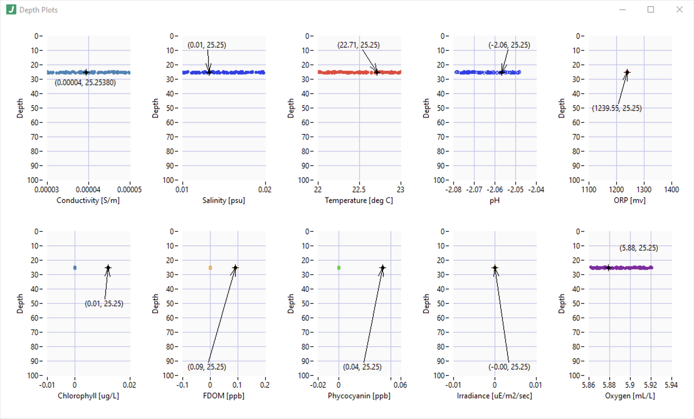
                     options.charts.{Chart ID}.plots[n].annotation object 
                    
                          An object defining how to annotate the most recent data point in the plot.  Annotations consist of several parts, some of which are optional: point, point decoration, and the annotation value (which is the most recent plot value). 
                         Required: true 
                         Default: (not specified; see any element defaults within) 


                     options.charts.{Chart ID}.plots[n].annotation.enable boolean 
                    
                          Whether to render an annotation on the most recent data point in the plot. 
                         Required: true 
                         Default: false 


                     options.charts.{Chart ID}.plots[n].annotation.showLabel boolean 
                    
                          Whether to also display the x and y values of the annotated point. 
                         Required: true 
                         Default: true 


                     options.charts.{Chart ID}.plots[n].annotation.showArrow boolean 
                    
                          Whether to draw an arrow from the label to the corresponding (most recent plotted) data point. 
                         Required: true 
                         Default: false 


                     options.charts.{Chart ID}.plots[n].annotation.color object 
                    
                          The color to use for plot points specified as an RGB value. 
                         Required: true 
                         Default: (not specified; see any element defaults within) 


                     options.charts.{Chart ID}.plots[n].annotation.color.r integer 
                    
                          The red component of the RGB color definition. 
                         Required: true 
                         Default: 100 


                     options.charts.{Chart ID}.plots[n].annotation.color.g integer 
                    
                          The green component of the RGB color definition. 
                         Required: true 
                         Default: 100 


                     options.charts.{Chart ID}.plots[n].annotation.color.b integer 
                    
                          The blue component of the RGB color definition. 
                         Required: true 
                         Default: 100 


                     options.charts.{Chart ID}.plots[n].annotation.pointStyle enum (string) 
                    
                          The annotation point style such as a circle vs a square. 
                         Required: true 
                         Default: "circleFull" 
                         Enum Items: "none" | "circleEmpty" | "circleFull" | "circleFullDot" | "circleEmptyDot" | "squareEmpty" | "squareFull" | "squareFullDot" | "squareEmptyDot" | "squareFullSmall" | "dot" | "cross" | "crossSmall" | "X" | "x" | "diamondFullDot" | "squareEmptySmall" 


                     options.charts.{Chart ID}.plots[n].annotation.pointDecoration enum (string) 
                    
                          The decoration to use on the anntation point, such as putting crosshair-like dashes on the annotation point. 
                         Required: true 
                         Default: "dashBoth" 
                         Enum Items: "none" | "dashVertical" | "dashHorizontal" | "dashBoth" | "lineVertical" | "lineHorizontal" | "lineBoth" | "dashVerticalLineHorizontal" | "dashHorizontalLineVertical" 


                     options.charts.{Chart ID}.plots[n].annotation.label object 
                    
                          An object defining how to render the annotation label. 
                         Required: true 
                         Default: (not specified; see any element defaults within) 


                     options.charts.{Chart ID}.plots[n].annotation.label.template string 
                    
                          A template string specifying how to display the annotation. Use @PLOT{xValue} and @PLOT{yValue} to specify values in the template string.  If the template string is empty, the format defaults to the xy coordinate point style (@PLOT{xValue}, @PLOT{yValue}) for backwards compatibility.  To prevent the label from displaying at all, set showLabel to false under the annotation properties. 
                         Required: true 
                         Default: "(@PLOT{xValue}, @PLOT{yValue})" 


                     options.charts.{Chart ID}.plots[n].annotation.label.anchorPosition enum (string) 
                    
                          The anchor position of the label.  The padding will apply relative to this selected anchor position. 
                         Required: true 
                         Default: "Point" 
                         Enum Items: "Point" | "TopLeft" | "TopCenter" | "TopRight" | "BottomLeft" | "BottomCenter" | "BottomRight" | "MiddleLeft" | "MiddleRight" 


                     options.charts.{Chart ID}.plots[n].annotation.label.padding object 
                    
                          An object defining x and y padding in pixels, relative to the anchorPosition, at which to render the annotation label.  Positive means move inward on the graph from the anchor position. 
                         Required: true 
                         Default: (not specified; see any element defaults within) 


                     options.charts.{Chart ID}.plots[n].annotation.label.padding.x integer 
                    
                          The x-padding in pixels relative to the anchor position. 
                         Required: true 
                         Default: 0 


                     options.charts.{Chart ID}.plots[n].annotation.label.padding.y integer 
                    
                          The y-padding in pixels relative to the anchor position. 
                         Required: true 
                         Default: 20 


                     options.charts.{Chart ID}.plots[n].properties object 
                    
                          An object defining the plot properties. 
                         Required: true 
                         Default: (not specified; see any element defaults within) 


                     options.charts.{Chart ID}.plots[n].properties.visible boolean 
                    
                          Whether the plot is visible in the chart. 
                         Required: true 
                         Default: true 


                     options.charts.{Chart ID}.plots[n].properties.antiAlias boolean 
                    
                          Whether the apply antiAliasing when rendering the plot. 
                         Required: true 
                         Default: true 


                     options.charts.{Chart ID}.plots[n].properties.pointStyle enum (string) 
                    
                          The point style to use for the plot. 
                         Required: true 
                         Default: "circleFull" 
                         Enum Items: "none" | "circleEmpty" | "circleFull" | "circleFullDot" | "circleEmptyDot" | "squareEmpty" | "squareFull" | "squareFullDot" | "squareEmptyDot" | "squareFullSmall" | "dot" | "cross" | "crossSmall" | "X" | "x" | "diamondFullDot" | "squareEmptySmall" 


                     options.charts.{Chart ID}.plots[n].properties.lineStyle enum (string) 
                    
                          The line style to use for the plot. 
                         Required: true 
                         Default: "solid" 
                         Enum Items: "solid" | "dash" | "dot" | "dashdot" | "dashdotdot" 


                     options.charts.{Chart ID}.plots[n].properties.lineWidth enum (string) 
                    
                          The line width to use for the plot. 
                         Required: true 
                         Default: "1" 
                         Enum Items: "0" | "1" | "2" | "3" | "4" | "5" 


                     options.charts.{Chart ID}.plots[n].properties.fillTo enum (string) 
                    
                          The color fill approach to use for the plot.  For example, "below" would apply the line color to the area below the plot in the chart. 
                         Required: true 
                         Default: "none" 
                         Enum Items: "none" | "zero" | "below" | "above" 


                     options.charts.{Chart ID}.plots[n].properties.interpolation enum (string) 
                    
                          The interpolation strategy to apply between points. 
                         Required: true 
                         Default: "none" 
                         Enum Items: "none" | "stepwiseVertical" | "linear" | "stepwiseHorizontal" | "stepwiseHorizontalCentered" | "stepwiseVerticalCentered" 


                     options.charts.{Chart ID}.plots[n].properties.lineColor objectstring 
                    
                          The color to use for the plot line specified as an RGB value. 
                         Required: true 
                         Default: "auto" 


                     options.charts.{Chart ID}.plots[n].properties.pointColor objectstring 
                    
                          The color to use for plot points specified as an RGB value. 
                         Required: true 
                         Default: "auto" 


                     options.logger object 
                    
                          Defines the logging (data and errors) for this plugin.  Note that a LOG variable space is provided here, as well as the VAR variable space.  Available variables are: @LOG{LOGGERNAME}, @LOG{TIMESTAMP}, @LOG{LOGMESSAGE}, @LOG{ERRORMESSAGE}, and @VAR{instanceName} are available variables.  note: @LOG{LOGGERNAME} is equal to the @VAR{instanceName} here. 
                         Required: true 
                         Default: (not specified; see any element defaults within) 


                     options.logger.Enable boolean 
                    
                          Whether to enable the logger. 
                         Required: true 
                         Default: true 


                     options.logger.LogFolder string 
                    
                          The folder in which to write log files. 
                         Required: true 
                         Default: "\\JADE_LOGS\\@VAR{instanceName}" 


                     options.logger.ErrorsOnly boolean 
                    
                          Whether to log only errors. 
                         Required: true 
                         Default: true 


                     options.logger.DiskThrashPeriod integer 
                    
                          The period in milliseconds with which to flush the file buffer to ensure it's committed to the hard drive.  Note: This is a performance consideration to prevent writing to disk too frequently. 
                         Required: true 
                         Default: 1000 


                     options.logger.FileSizeLimit integer 
                    
                          The file size at which to create new files. 
                         Required: true 
                         Default: 1000000 


                     options.logger.LogEntryFormat string 
                    
                          The format to use when writing log entries when errors are not present. 
                         Required: true 
                         Default: "\n\n@LOG{LOGMESSAGE}" 


                     options.logger.ErrorLogEntryFormat string 
                    
                          The message format used to construct error log entries. 
                         Required: true 
                         Default: "\n\n@LOG{ERRORMESSAGE}" 


                     panel object 
                    
                           
                         Required: true 
                         Default: (not specified; see any element defaults within) 


                     panel.open boolean 
                    
                          Whether to open the front panel immediately when run. 
                         Required: true 
                         Default: true 


                     panel.state enum (string) 
                    
                          The state in which the window will open. 
                         Required: true 
                         Default: "Standard" 
                         Enum Items: "Standard" | "Hidden" | "Closed" | "Minimized" | "Maximized" 


                     panel.transparency integer 
                    
                          The transparency of the window. 0 = opaque, 100 = invisible. 
                         Required: true 
                         Default: 0 


                     panel.title string 
                    
                          The title of the plugin window when it runs.  Note that the variable 'instanceName' is provided here in a VAR variable container. 
                         Required: true 
                         Default: "@VAR{instanceName}" 


                     panel.titleBarVisible boolean 
                    
                          Whether the window title bar is visible. 
                         Required: true 
                         Default: true 


                     panel.makeActive boolean 
                    
                          Whether the window becomes active when opened. 
                         Required: true 
                         Default: false 


                     panel.bringToFront boolean 
                    
                          Whether the window is brought to the front / top of other windows when opened. 
                         Required: true 
                         Default: false 


                     panel.minimizable boolean 
                    
                          Whether the window is minimizable. 
                         Required: true 
                         Default: true 


                     panel.resizable boolean 
                    
                          Whether the window is resizable. 
                         Required: true 
                         Default: true 


                     panel.closeable boolean 
                    
                          Whether the window is closeable. 
                         Required: true 
                         Default: true 


                     panel.closeWhenDone boolean 
                    
                          Whether to close the window when complete. 
                         Required: true 
                         Default: true 


                     panel.center boolean 
                    
                          Whether to center the window when opened.  Note: this property overrides the 'position' property. 
                         Required: true 
                         Default: false 


                     panel.position object 
                    
                          The position of the window when opened the first time. 
                         Required: true 
                         Default: (not specified; see any element defaults within) 


                     panel.position.top integer 
                    
                          The vertical position of the window in pixels from the top edge of the viewport.  Note: this property is overriden by the 'center' property. 
                         Required: true 
                         Default: 100 


                     panel.position.left integer 
                    
                          The horizontal position of the window in pixels from the left edge of the viewport.  Note: this property is overriden by the 'center' property. 
                         Required: true 
                         Default: 100 


                     panel.size object 
                    
                          The size of the window when opened the first time. 
                         Required: false 
                         Default: (not specified; see any element defaults within) 


                     panel.size.width integer 
                    
                          The width of the window in pixels.  -1 means use the default width for the panel.  Note that depending on panel features exposed, there may be a limit to how small a panel can become. 
                         Required: true 
                         Default: -1 


                     panel.size.height integer 
                    
                          The height of the window in pixels.  -1 means use the default height for the panel.  Note that depending on panel features exposed, there may be a limit to how small a panel can become. 
                         Required: true 
                         Default: -1 


                     channel object 
                    
                          The communication channel definition used by this plugin. Note: this section rarely needs modifications. In many cases, the underlying plugin implementation depends on at least some of these settings having the values below. Consult with a JADE expert before making changes to this section if you are unfamiliar with the implications of changes to this section. 
                         Required: true 
                         Default: (not specified; see any element defaults within) 


                     channel.SendBreakTimeout integer 
                    
                          The timeout duration in milliseconds to wait for sending messages. 
                         Required: true 
                         Default: 1000 


                     channel.WaitOnBreakTimeout integer 
                    
                          The timeout duration in milliseconds to wait for receiving messages.  Note: -1 means wait indefinitely or until shutdown is signalled. 
                         Required: true 
                         Default: -1 


                     channel.WaitOnShutdownTimeout integer 
                    
                          The timeout duration in milliseconds to wait for shutdown acknowledgment. 
                         Required: true 
                         Default: 2000 


                     channel.ThrowTimeoutErrors boolean 
                    
                          Whether to throw timeout errors vs simply returning a boolean indicating whether a timeout occurred. 
                         Required: true 
                         Default: false 


                     channel.ThrowShutdownUnacknowledgedErrors boolean 
                    
                          Whether to throw 'shutdown unacknowledged' errors. 
                         Required: true 
                         Default: true 


                     channel.QueueSize integer 
                    
                          The size of the underlying communication queue in bytes.  Note: -1 means unbounded (i.e. grow as needed with available memory). 
                         Required: true 
                         Default: 100 


                     channel.SendBreakEnqueueType enum (string) 
                    
                          The enqueue strategy employed on the underlying queue for standard messages. 
                         Required: true 
                         Default: "LossyEnqueue" 
                         Enum Items: "Enqueue" | "EnqueueAtFront" | "LossyEnqueue" | "LossyEnqueueAtFront" 


                     channel.SendErrorEnqueueType enum (string) 
                    
                          The enqueue strategy employed on the underlying queue for error messages. 
                         Required: true 
                         Default: "LossyEnqueue" 
                         Enum Items: "Enqueue" | "EnqueueAtFront" | "LossyEnqueue" | "LossyEnqueueAtFront" 


                     channel.SendShutdownEnqueueType enum (string) 
                    
                          The enqueue strategy employed on the underlying queue for the shutdown message. 
                         Required: true 
                         Default: "LossyEnqueueAtFront" 
                         Enum Items: "Enqueue" | "EnqueueAtFront" | "LossyEnqueue" | "LossyEnqueueAtFront" 


                     channel.FlushQueueBeforeWaitingOnBreak boolean 
                    
                          Whether to flush the queue upon waiting for new messages (i.e. whether to clear the queue and wait for the next 'new' message; this has the effect of removing old messages and waiting for the next message. 
                         Required: true 
                         Default: false 


                     channel.FlushQueueAfterBreaking boolean 
                    
                          Whether to flush the queue after receiving a new message (i.e. whether to handle the next message coming in the queue and then flush; this has the effect of handling the oldest message (if it exsits) or the next message before flushing the queue. 
                         Required: true 
                         Default: false