@sixclear/brooks-mass-flow-controller
Brooks Mass Flow Controller v1.1.0
New in Version 1.1.0
This version adds a chart configuration option for customizing the chart / graph in the plugin interface. These options are similar to the options available for configuring charts in Multiple Charts plugin instances. Below is an example configuration snippet for the new chart option, where notice there is a single plot named flowRate, the only plot which this plugin currently produces in the chart:
"chart": {
    "properties": {
        "label": "",
        "xAxis": {
            "label": "Time",
            "format": "%<%H:%M:%S>T",
            "duration": 1200,
            "numTicks": 10,
            "updateMode": "startDataOnLeft" // or startDataOnRight
        },
        "yAxis": {
            "label": "Temperature",
            "flipped": false,
            "min": 0,
            "max": 110,
            "increment": 1,
            "format": "%#.2f",
            "autoscale": "on"
        },
        "plotArea": {
            "fgColor": {
                "r": 255,
                "g": 255,
                "b": 255
            },
            "bgColor": {
                "r": 250,
                "g": 250,
                "b": 250
            }
        }
    },
    "plots": {
        "flowRate": {
            "properties": {
                "visible": true,
                "antiAlias": false,
                "pointStyle": "circleFull",
                "lineStyle": "solid",
                "lineWidth": "2",
                "fillTo": "none",
                "interpolation": "linear",
                "lineColor": {
                    "r": 0,
                    "g": 128,
                    "b": 128
                },
                "pointColor": {
                    "r": 0,
                    "g": 128,
                    "b": 128
                }
            },
            "annotation": {
                "enable": false,
                "showLabel": true,
                "showArrow": false,
                "color": {
                    "r": 0,
                    "g": 0,
                    "b": 0
                },
                "pointStyle": "circleEmpty",
                "pointDecoration": "none",
                "label": {
                    "template": "(@PLOT{yValue}, @PLOT{yValue})",
                    "xValueFormat": "%.2f",
                    "yValueFormat": "%.1f",
                    "anchorPosition": "TopCenter",
                    "padding": {
                        "x": 0,
                        "y": 10
                    }
                }
            }
        }
    }
}
Overview
This plugin provides control, monitoring, and data publishing for Brooks mass flow controllers. Configuration for the plugin supports:
- serial port configuration
- device tag number
- number of configured gases
- flow reference (ex. calibration)
- ramp time
- poll period
- publish period
- whether to publish on change and/or periodically
- disable ui capabilities for gas type, flow rate setpoint, and flow rate set unit controls
- chart history length
- number of errors to display
- initialization commands
- and more
User Interface
The image below shows the plugin’s interface.
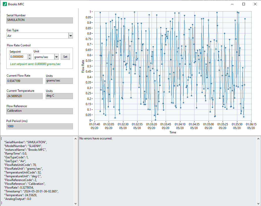
The interface is devided into four sections:
- control and core monitoring (upper left)
- data chart (upper right)
- published data payload (bottom left)
- error log (bottom right)
Configuration Example
Configuration Details
ROOT object
This top level object holds all configuration information for this plugin.
Required: true
Default: (not specified; see any element defaults within)
options object
Configuration options specific to this plugin. Note that variables and expressions are generally allowed in this section.
Required: true
Default: (not specified; see any element defaults within)
options.deviceTagNumber integer
The unique identifier for the device which is used as its address on the serial bus for communication.
Required: true
Default: 32202035
options.numberOfConfiguredGases integer
The number of gases configured / calibrated on the device (usually by the manufacturer).
Required: true
Default: 2
options.flowReference enum (string)
The flow reference to use when setting the flow rate unit and helps determine underlying conversion coefficients for volumetric flow rates (ex. ml/sec). This is only important for volumetric flow rates (ex. ml/sec) because the volume changes with temperature and pressure. Mass flow rates (ex. grams/sec) do not depend on temperature and pressure and therefore are independent of this setting.
Required: true
Default: "Normal"
Enum Items: "Normal" | "Standard" | "Calibration"
options.rampTime number
The time to ramp to a new flow rate setpoint in seconds.
Required: true
Default: 5
options.pollPeriod integer
The period with which the plugin polls the mass flow controller for the current flow rate, temperature, etc.
Required: true
Default: 1000
options.publishPeriod integer
The period with which the plugin publishes data for consumption by any subscribing plugins.
Required: true
Default: 1000
options.publishOnChange boolean
Whether to publish data when the user makes changes to flow rate or gas type on the interface.
Required: true
Default: true
options.publishPeriodically boolean
Whether to publish data periodically.
Required: true
Default: true
options.uiDisableGasTypeControl boolean
Whether to disable the Gas Type control (i.e. prevent users from making changes).
Required: true
Default: false
options.uiDisableFlowRateSetpointControl boolean
Whether to disable the Flow Rate Setpoint control (i.e. prevent users from making changes).
Required: true
Default: false
options.uiDisableFlowRateSetUnitControl boolean
Whether to disable the Flow Rate Unit control (i.e. prevent users from making changes).
Required: true
Default: false
options.chartHistoryLength integer
The number of data points to keep in the chart in the user interface. The most recent data points are always shown.
Required: true
Default: 1000
options.numberOfErrorsToDisplay integer
The maximum number of errors to display in the interface. If the specified number of errors occur, subsequent new errors will not be displayed. This ensures that the first error is always displayed.
Required: true
Default: 10
options.initializationCommands array
An array of initialization commands to send to the mass flow controller. These commands are sent before the UI is even initialized and before any user interaction is processed.
Required: true
Default:
[
    {
        "command": "SetGasType",
        "gasTypeCode": 1
    },
    {
        "command": "SetFlowRate",
        "flowRate": 0,
        "unit": "grams/sec"
    }
]
options.initializationCommands[n] object
An initialization command to send.
Required: false
Default: (not specified; see any element defaults within)
options.initializationCommands[n]::{Set Gas Type} object
An object defining the gas type to set.
Required: false
Default: (not specified; see any element defaults within)
options.initializationCommands[n]::{Set Gas Type}.command enum (string)
The set gas type command.
Required: true
Default: "SetGasType"
Enum Items: "SetGasType"
options.initializationCommands[n]::{Set Gas Type}.gasTypeCode integer
The gas type code to set (which sets the gas type) on the mass flow controller.
Required: true
Default: 1
options.initializationCommands[n]::{Set Flow Rate} object
An object defining the flow rate to set.
Required: false
Default: (not specified; see any element defaults within)
options.initializationCommands[n]::{Set Flow Rate}.command enum (string)
The set flow rate command.
Required: true
Default: "SetFlowRate"
Enum Items: "SetFlowRate"
options.initializationCommands[n]::{Set Flow Rate}.flowRate number
The flow rate to set on the mass flow controller.
Required: true
Default: 0
options.initializationCommands[n]::{Set Flow Rate}.unit enum (string)
The flow rate unit to set on the mass flow controller.
Required: true
Default: "grams/sec"
Enum Items: "ft^3/min" | "gal/min" | "liters/min" | "imp gal/min" | "m^3/hr" | "gal/sec" | "liters/sec" | "ft^3/sec" | "ft^3/day" | "m^3/sec" | "m^3/day" | "imp gal/hr" | "imp gal/day" | "grams/sec" | "grams/min" | "grams/hr" | "kg/sec" | "kg/min" | "kg/hr" | "kg/day" | "lbs/sec" | "lbs/min" | "lbs/hr" | "lbs/day" | "ft^3/hr" | "m^3/min" | "barrels/sec" | "barrels/min" | "barrels/hr" | "barrels/day" | "gal/hr" | "imp gal/sec" | "liters/hr" | "ml/sec" | "ml/min" | "ml/hr" | "ml/day" | "liters/day" | "in^3/sec" | "in^3/min" | "in^3/hr" | "in^3/day" | "gal/day" | "cc/min" | "cc/sec" | "cc/hr" | "grams/day" | "onces/sec" | "onces/min" | "onces/hr" | "onces/day" | "cc/day"
options.chart object
An object the chart properties, including the chart's plot properties.
Required: true
Default:
{
    "properties": {
        "label": "",
        "xAxis": {
            "label": "Time",
            "format": "%<%H:%M:%S>T",
            "duration": 100,
            "numTicks": 10,
            "updateMode": "startDataOnLeft"
        },
        "yAxis": {
            "label": "Value",
            "flipped": false,
            "min": 0,
            "max": 200,
            "increment": 1,
            "format": "%#.2f",
            "autoscale": "on"
        },
        "plotArea": {
            "fgColor": {
                "r": 255,
                "g": 255,
                "b": 255
            },
            "bgColor": {
                "r": 250,
                "g": 250,
                "b": 250
            }
        }
    },
    "plots": {
        "flowRate": {
            "properties": {
                "visible": true,
                "antiAlias": false,
                "pointStyle": "circleFull",
                "lineStyle": "solid",
                "lineWidth": "2",
                "fillTo": "none",
                "interpolation": "linear",
                "lineColor": {
                    "r": 235,
                    "g": 64,
                    "b": 52
                },
                "pointColor": {
                    "r": 235,
                    "g": 64,
                    "b": 52
                }
            },
            "annotation": {
                "enable": false,
                "showLabel": true,
                "showArrow": false,
                "color": {
                    "r": 0,
                    "g": 0,
                    "b": 0
                },
                "pointStyle": "circleFull",
                "pointDecoration": "dashBoth",
                "label": {
                    "template": "(@PLOT{xValue}, @PLOT{yValue})",
                    "xValueFormat": "%.2f",
                    "yValueFormat": "%.2f",
                    "anchorPosition": "TopCenter",
                    "padding": {
                        "x": 0,
                        "y": 10
                    }
                }
            }
        }
    }
}
options.chart.properties object
An object definiting the chart properties.
Required: true
Default: (not specified; see any element defaults within)
options.chart.properties.label string
The label to display on the chart.
Required: true
Default: "My Plot Name"
options.chart.properties.xAxis object
The x-axis properties.
Required: true
Default:
{
    "label": "x-axis",
    "format": "%d",
    "flipped": false,
    "min": 0,
    "max": 10,
    "increment": 1,
    "autoscale": "on"
}
options.chart.properties.xAxis::{Specify Min/Max/Autoscale} object
This configuration for the x-axis requires configuring label, format, flipped, min, max, increment, and autoscale.
Required: false
Default: (not specified; see any element defaults within)
options.chart.properties.xAxis::{Specify Min/Max/Autoscale}.label string
The x-axis label to display.
Required: true
Default: "x-axis"
options.chart.properties.xAxis::{Specify Min/Max/Autoscale}.format string
A string defining the x-axis format.
Required: true
Default: "%d"
options.chart.properties.xAxis::{Specify Min/Max/Autoscale}.flipped boolean
Whether to flip the x-axis (ex. if true, instead of rendering 0 on the left and 10 on the right of the x-axis, it would render 0 on the right and 10 on the left.
Required: true
Default: false
options.chart.properties.xAxis::{Specify Min/Max/Autoscale}.min number
The x-axis min value.
Required: true
Default: 0
options.chart.properties.xAxis::{Specify Min/Max/Autoscale}.max number
The x-axis max value.
Required: true
Default: 10
options.chart.properties.xAxis::{Specify Min/Max/Autoscale}.increment number
The x-axis increment used to display x-axis tick marks.
Required: true
Default: 1
options.chart.properties.xAxis::{Specify Min/Max/Autoscale}.autoscale enum (string)
Whether to autoscale the x-axis. The value "on" autoscales on every update, "off" never autoscales, and "once" autoscales just once when data is first rendered.
Required: true
Default: "on"
Enum Items: "on" | "off" | "once"
options.chart.properties.xAxis::{Specify Duration} object
This configuration for the x-axis required configuring label, format, duration, and numTicks.
Required: false
Default: (not specified; see any element defaults within)
options.chart.properties.xAxis::{Specify Duration}.label string
The x-axis label to display.
Required: true
Default: "x-axis"
options.chart.properties.xAxis::{Specify Duration}.format string
A string defining the x-axis format.
Required: true
Default: "%d"
options.chart.properties.xAxis::{Specify Duration}.duration number
The time duration in seconds to display on the x-axis. Note that there is an upper limit of 2^20 points per plot kept in the buffer underneath which effectively limits the duration of actual data which can be displayed. This is usually not a problem in most systems, but noteworthy here for corner cases.
Required: true
Default: 0
options.chart.properties.xAxis::{Specify Duration}.numTicks number
The number of ticks to show on the x-axis.
Required: true
Default: 0
options.chart.properties.xAxis::{Specify Duration}.updateMode enum (string)
This option determines whether data begins populating on the left and marches to the right until the chart is full of data, or begins populating data on the right and fills space to the left. In both cases, when the chart is full of data corresponding to the specified duration, data will shift to show the most recent points in that specified duration.
Required: true
Default: "startDataOnLeft"
Enum Items: "startDataOnLeft" | "startDataOnRight"
options.chart.properties.yAxis object
The y-axis properties.
Required: true
Default: (not specified; see any element defaults within)
options.chart.properties.yAxis.label string
The y-axis label to display.
Required: true
Default: "y-axis"
options.chart.properties.yAxis.flipped boolean
Whether to flip the y-axis (ex. if true, instead of rendering 0 on the bottom and 10 on the top of the y-axis, it would render 0 on the top and 10 on the bottom.
Required: true
Default: false
options.chart.properties.yAxis.min number
The y-axis min value.
Required: true
Default: 0
options.chart.properties.yAxis.max number
The y-axis max value.
Required: true
Default: 10
options.chart.properties.yAxis.increment number
The y-axis increment used to display y-axis tick marks.
Required: true
Default: 1
options.chart.properties.yAxis.format string
A string defining the y-axis format.
Required: true
Default: "%d"
options.chart.properties.yAxis.autoscale enum (string)
Whether to autoscale the y-axis. The value "on" autoscales on every update, "off" never autoscales, and "once" autoscales just once when data is first rendered.
Required: true
Default: "on"
Enum Items: "on" | "off" | "once"
options.chart.properties.plotArea object
The plot area properties.
Required: true
Default: (not specified; see any element defaults within)
options.chart.properties.plotArea.fgColor object
The plot area foreground color specified as an RGB value.
Required: true
Default: (not specified; see any element defaults within)
options.chart.properties.plotArea.fgColor.r integer
The red component of the RGB color definition.
Required: true
Default: 255
options.chart.properties.plotArea.fgColor.g integer
The green component of the RGB color definition.
Required: true
Default: 255
options.chart.properties.plotArea.fgColor.b integer
The blue component of the RGB color definition.
Required: true
Default: 255
options.chart.properties.plotArea.bgColor object
The plot area background color specified as an RGB value.
Required: true
Default: (not specified; see any element defaults within)
options.chart.properties.plotArea.bgColor.r integer
The red component of the RGB color definition.
Required: true
Default: 250
options.chart.properties.plotArea.bgColor.g integer
The green component of the RGB color definition.
Required: true
Default: 250
options.chart.properties.plotArea.bgColor.b integer
The blue component of the RGB color definition.
Required: true
Default: 250
options.chart.plots object
An array of plot objects which define plot properties and data.
Required: true
Default: (not specified; see any element defaults within)
options.chart.plots.flowRate object
An object containing plot properties and annotation options.
Required: true
Default: (not specified; see any element defaults within)
options.chart.plots.flowRate.properties object
An object defining the plot properties.
Required: true
Default: (not specified; see any element defaults within)
options.chart.plots.flowRate.properties.visible boolean
Whether the plot is visible in the chart.
Required: true
Default: true
options.chart.plots.flowRate.properties.antiAlias boolean
Whether the apply antiAliasing when rendering the plot.
Required: true
Default: true
options.chart.plots.flowRate.properties.pointStyle enum (string)
The point style to use for the plot.
Required: true
Default: "circleFull"
Enum Items: "none" | "circleEmpty" | "circleFull" | "circleFullDot" | "circleEmptyDot" | "squareEmpty" | "squareFull" | "squareFullDot" | "squareEmptyDot" | "squareFullSmall" | "dot" | "cross" | "crossSmall" | "X" | "x" | "diamondFullDot" | "squareEmptySmall"
options.chart.plots.flowRate.properties.lineStyle enum (string)
The line style to use for the plot.
Required: true
Default: "solid"
Enum Items: "solid" | "dash" | "dot" | "dashdot" | "dashdotdot"
options.chart.plots.flowRate.properties.lineWidth enum (string)
The line width to use for the plot.
Required: true
Default: "1"
Enum Items: "0" | "1" | "2" | "3" | "4" | "5"
options.chart.plots.flowRate.properties.fillTo enum (string)
The color fill approach to use for the plot. For example, "below" would apply the line color to the area below the plot in the chart.
Required: true
Default: "none"
Enum Items: "none" | "zero" | "below" | "above"
options.chart.plots.flowRate.properties.interpolation enum (string)
The interpolation strategy to apply between points.
Required: true
Default: "none"
Enum Items: "none" | "stepwiseVertical" | "linear" | "stepwiseHorizontal" | "stepwiseHorizontalCentered" | "stepwiseVerticalCentered"
options.chart.plots.flowRate.properties.lineColor objectstring
The color to use for the plot line specified as an RGB value.
Required: true
Default: "auto"
options.chart.plots.flowRate.properties.pointColor objectstring
The color to use for plot points specified as an RGB value.
Required: true
Default: "auto"
options.chart.plots.flowRate.annotation object
An object defining how to annotate the most recent data point in the plot. Annotations consist of several parts, some of which are optional: point, point decoration, and the annotation value (which is the most recent plot value).
Required: true
Default: (not specified; see any element defaults within)
options.chart.plots.flowRate.annotation.enable boolean
Whether to render an annotation on the most recent data point in the plot.
Required: true
Default: false
options.chart.plots.flowRate.annotation.showLabel boolean
Whether to also display the x and y values of the annotated point.
Required: true
Default: true
options.chart.plots.flowRate.annotation.showArrow boolean
Whether to draw an arrow from the label to the corresponding (most recent plotted) data point.
Required: true
Default: false
options.chart.plots.flowRate.annotation.color object
The color to use for plot points specified as an RGB value.
Required: true
Default: (not specified; see any element defaults within)
options.chart.plots.flowRate.annotation.color.r integer
The red component of the RGB color definition.
Required: true
Default: 100
options.chart.plots.flowRate.annotation.color.g integer
The green component of the RGB color definition.
Required: true
Default: 100
options.chart.plots.flowRate.annotation.color.b integer
The blue component of the RGB color definition.
Required: true
Default: 100
options.chart.plots.flowRate.annotation.pointStyle enum (string)
The annotation point style such as a circle vs a square.
Required: true
Default: "circleFull"
Enum Items: "none" | "circleEmpty" | "circleFull" | "circleFullDot" | "circleEmptyDot" | "squareEmpty" | "squareFull" | "squareFullDot" | "squareEmptyDot" | "squareFullSmall" | "dot" | "cross" | "crossSmall" | "X" | "x" | "diamondFullDot" | "squareEmptySmall"
options.chart.plots.flowRate.annotation.pointDecoration enum (string)
The decoration to use on the anntation point, such as putting crosshair-like dashes on the annotation point.
Required: true
Default: "dashBoth"
Enum Items: "none" | "dashVertical" | "dashHorizontal" | "dashBoth" | "lineVertical" | "lineHorizontal" | "lineBoth" | "dashVerticalLineHorizontal" | "dashHorizontalLineVertical"
options.chart.plots.flowRate.annotation.label object
An object defining how to render the annotation label.
Required: true
Default: (not specified; see any element defaults within)
options.chart.plots.flowRate.annotation.label.template string
A template string specifying how to display the annotation. Use @PLOT{xValue} and @PLOT{yValue} to specify values in the template string. If the template string is empty, the format defaults to the xy coordinate point style (@PLOT{xValue}, @PLOT{yValue}) for backwards compatibility. To prevent the label from displaying at all, set showLabel to false under the annotation properties.
Required: true
Default: "(@PLOT{xValue}, @PLOT{yValue})"
options.chart.plots.flowRate.annotation.label.xValueFormat string
A format string specifying how to display the annotation x-value.
Required: true
Default: "%.2f"
options.chart.plots.flowRate.annotation.label.yValueFormat string
A format string specifying how to display the annotation y-value.
Required: true
Default: "%.2f"
options.chart.plots.flowRate.annotation.label.anchorPosition enum (string)
The anchor position of the label. The padding will apply relative to this selected anchor position.
Required: true
Default: "Point"
Enum Items: "Point" | "TopLeft" | "TopCenter" | "TopRight" | "BottomLeft" | "BottomCenter" | "BottomRight" | "MiddleLeft" | "MiddleRight"
options.chart.plots.flowRate.annotation.label.padding object
An object defining x and y padding in pixels, relative to the anchorPosition, at which to render the annotation label. Positive means move inward on the graph from the anchor position.
Required: true
Default: (not specified; see any element defaults within)
options.chart.plots.flowRate.annotation.label.padding.x integer
The x-padding in pixels relative to the anchor position.
Required: true
Default: 0
options.chart.plots.flowRate.annotation.label.padding.y integer
The y-padding in pixels relative to the anchor position.
Required: true
Default: 20
options.serialPortConfiguration object
Defines the serial port configuration.
Required: true
Default: (not specified; see any element defaults within)
options.serialPortConfiguration.SimulationMode boolean
Whether to run in simulation mode.
Required: true
Default: true
options.serialPortConfiguration.Address string
The address of the serial port.
Required: true
Default: "COM1"
options.serialPortConfiguration.Timeout integer
The timeout duration in milliseconds used for write and read operations.
Required: true
Default: 5000
options.serialPortConfiguration.BaudRate integer
The baud rate to use for serial communication. The available baud rates depend on the serial interface. Common baud rates include: 300, 600, 1200, 2400, 4800, 9600, 38400, 14400, 19200, 57600, 230400, 115200, 460800. Less common though not terrifically uncommon baud rates include: 100, 28800, 56000, 128000, 153600, 256000, 921600.
Required: true
Default: 19200
options.serialPortConfiguration.DataBits enum (integer)
The number of data bits used for underlying character encoding for transmission.
Required: true
Default: 8
Enum Items: 5 | 6 | 7 | 8
options.serialPortConfiguration.StopBits enum (string)
The number of bits which indicate the end of a given character transmission.
Required: true
Default: "1.0"
Enum Items: "1.0" | "1.5" | "2.0"
options.serialPortConfiguration.Parity enum (string)
The parity or error checking convention to use.
Required: true
Default: "Odd"
Enum Items: "None" | "Odd" | "Even" | "Mark" | "Space"
options.serialPortConfiguration.FlowControl string
The flow control convention to use.
Required: true
Default: "None"
options.logger object
Defines the logging (data and errors) for this plugin. Note that a LOG variable space is provided here, as well as the VAR variable space. Available variables are: @LOG{LOGGERNAME}, @LOG{TIMESTAMP}, @LOG{LOGMESSAGE}, @LOG{ERRORMESSAGE}, @VAR{instanceName}, @VAR{ModelNumber}, @VAR{SerialNumber}, and @VAR{RampTime}. Note: @LOG{LOGGERNAME} is equal to the @VAR{instanceName} here.
Required: true
Default: (not specified; see any element defaults within)
options.logger.Enable boolean
Whether to enable the logger.
Required: true
Default: true
options.logger.LogFolder string
The folder in which to write log files.
Required: true
Default: "\\JADE_LOGS\\@VAR{instanceName}"
options.logger.FileNameFormat string
The filename to use when creating log files. Note: if the filesize limit is reached new files will be created with enumerated suffixes such as: MyLogFile-1.txt, MyLogFile-2.txt, etc.
Required: true
Default: "@VAR{instanceName}-@LOG{TIMESTAMP}.csv"
options.logger.ErrorsOnly boolean
Whether to log only errors.
Required: true
Default: false
options.logger.DiskThrashPeriod integer
The period in milliseconds with which to flush the file buffer to ensure it's committed to the hard drive. Note: This is a performance consideration to prevent writing to disk too frequently.
Required: true
Default: 1000
options.logger.FileSizeLimit integer
The file size at which to create new files.
Required: true
Default: 1000000
options.logger.StartLogFormat string
The initial string to put into the log file (and subsequent files) when opened for the first time.
Required: true
Default: "Timestamp,Flow Rate,Flow Rate Unit,Temperature,Temperature Unit,Gas Type"
options.logger.EndLogFormat string
The final string to put in the log file when closed.
Required: true
Default: ""
options.logger.LogEntryFormat string
The format to use when writing log entries when errors are not present.
Required: true
Default: "@LOG{LOGMESSAGE}"
options.logger.LogMessageFormat string
The message format used to construct non-error log entries. Valid variables for this plugin are: @VAR{Timestamp}, @VAR{GasTypeCode}, @VAR{GasType}, @VAR{FlowRateUnitCode}, @VAR{FlowRateUnit}, @VAR{FlowRate}, @VAR{TemperatureUnitCode}, @VAR{TemperatureUnit}, @VAR{Temperature}, @VAR{FlowReferenceCode}, @VAR{FlowReference}, @VAR{ModelNumber}, and @VAR{SerialNumber}. This is what gets assigned as the @LOG{LOGMESSAGE}. Note: this is an extension of the core logger configuration.
Required: true
Default: "\n@VAR{Timestamp},@VAR{FlowRate},@VAR{FlowRateUnit},@VAR{Temperature},@VAR{TemperatureUnit},@VAR{GasType}"
options.logger.ErrorLogEntryFormat string
The message format used to construct error log entries.
Required: true
Default: "\n\n@LOG{ERRORMESSAGE}\n\n"
options.logger.TimestampFormat string
The format used by the @LOG{TIMESTAMP} variable.
Required: true
Default: "%Y-%m-%d %H-%M-%S%3u"
panel object
Required: true
Default: (not specified; see any element defaults within)
panel.open boolean
Whether to open the front panel immediately when run.
Required: true
Default: true
panel.state enum (string)
The state in which the window will open.
Required: true
Default: "Standard"
Enum Items: "Standard" | "Hidden" | "Closed" | "Minimized" | "Maximized"
panel.transparency integer
The transparency of the window. 0 = opaque, 100 = invisible.
Required: true
Default: 0
panel.title string
The title of the plugin window when it runs. Note that the variable 'instanceName' is provided here in a VAR variable container.
Required: true
Default: "@VAR{instanceName}"
panel.titleBarVisible boolean
Whether the window title bar is visible.
Required: true
Default: true
panel.showMenuBar boolean
Whether the menu bar is visible.
Required: true
Default: false
panel.showToolBar boolean
Whether the toolbar is visible.
Required: true
Default: false
panel.makeActive boolean
Whether the window becomes active when opened.
Required: true
Default: false
panel.bringToFront boolean
Whether the window is brought to the front / top of other windows when opened.
Required: true
Default: false
panel.minimizable boolean
Whether the window is minimizable.
Required: true
Default: true
panel.resizable boolean
Whether the window is resizable.
Required: true
Default: true
panel.closeable boolean
Whether the window is closeable.
Required: true
Default: true
panel.closeWhenDone boolean
Whether to close the window when complete.
Required: true
Default: true
panel.center boolean
Whether to center the window when opened. Note: this property overrides the 'position' property.
Required: true
Default: false
panel.position object
The position of the window when opened the first time.
Required: true
Default: (not specified; see any element defaults within)
panel.position.top integer
The vertical position of the window in pixels from the top edge of the viewport. Note: this property is overriden by the 'center' property.
Required: true
Default: 100
panel.position.left integer
The horizontal position of the window in pixels from the left edge of the viewport. Note: this property is overriden by the 'center' property.
Required: true
Default: 100
panel.size object
The size of the window when opened the first time.
Required: false
Default: (not specified; see any element defaults within)
panel.size.width integer
The width of the window in pixels. -1 means use the default width for the panel. Note that depending on panel features exposed, there may be a limit to how small a panel can become.
Required: true
Default: -1
panel.size.height integer
The height of the window in pixels. -1 means use the default height for the panel. Note that depending on panel features exposed, there may be a limit to how small a panel can become.
Required: true
Default: -1
channel object
The communication channel definition used by this plugin. Note: this section rarely needs modifications. In many cases, the underlying plugin implementation depends on at least some of these settings having the values below. Consult with a JADE expert before making changes to this section if you are unfamiliar with the implications of changes to this section.
Required: true
Default: (not specified; see any element defaults within)
channel.SendBreakTimeout integer
The timeout duration in milliseconds to wait for sending messages.
Required: true
Default: 1000
channel.WaitOnBreakTimeout integer
The timeout duration in milliseconds to wait for receiving messages. Note: -1 means wait indefinitely or until shutdown is signalled.
Required: true
Default: -1
channel.WaitOnShutdownTimeout integer
The timeout duration in milliseconds to wait for shutdown acknowledgment.
Required: true
Default: 2000
channel.ThrowTimeoutErrors boolean
Whether to throw timeout errors vs simply returning a boolean indicating whether a timeout occurred.
Required: true
Default: false
channel.ThrowShutdownUnacknowledgedErrors boolean
Whether to throw 'shutdown unacknowledged' errors.
Required: true
Default: true
channel.QueueSize integer
The size of the underlying communication queue in bytes. Note: -1 means unbounded (i.e. grow as needed with available memory).
Required: true
Default: 100
channel.SendBreakEnqueueType enum (string)
The enqueue strategy employed on the underlying queue for standard messages.
Required: true
Default: "LossyEnqueue"
Enum Items: "Enqueue" | "EnqueueAtFront" | "LossyEnqueue" | "LossyEnqueueAtFront"
channel.SendErrorEnqueueType enum (string)
The enqueue strategy employed on the underlying queue for error messages.
Required: true
Default: "LossyEnqueue"
Enum Items: "Enqueue" | "EnqueueAtFront" | "LossyEnqueue" | "LossyEnqueueAtFront"
channel.SendShutdownEnqueueType enum (string)
The enqueue strategy employed on the underlying queue for the shutdown message.
Required: true
Default: "LossyEnqueueAtFront"
Enum Items: "Enqueue" | "EnqueueAtFront" | "LossyEnqueue" | "LossyEnqueueAtFront"
channel.FlushQueueBeforeWaitingOnBreak boolean
Whether to flush the queue upon waiting for new messages (i.e. whether to clear the queue and wait for the next 'new' message; this has the effect of removing old messages and waiting for the next message.
Required: true
Default: false
channel.FlushQueueAfterBreaking boolean
Whether to flush the queue after receiving a new message (i.e. whether to handle the next message coming in the queue and then flush; this has the effect of handling the oldest message (if it exsits) or the next message before flushing the queue.
Required: true
Default: false