Overview
The Data Table plugin subscribes to, computes, and displays data from any number of other plugins in a table. A convenient layout syntax allows for specifying the values and style for each cell. Cells can be styled initially with options for italics, bold, background color, text color, cell width, cell height, font name, and font size. Cells can also update dynamically from incoming data using variables and expressions. In particular, the cell value / text can be made dynamic, as well as the cell background color and text color.
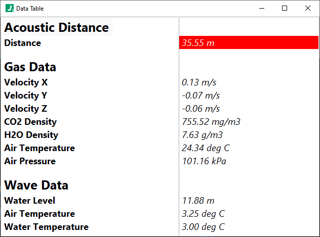
The ability to dynamically update the cell background and text colors allows the table to act as an alarm interface as well. For example, you may make the background color of a cell red when a value exceeds a specified threshold, as shown above. Many other attributes of the table can be configured, such as row/col headers, whether to show scrollbars, whether to display vertical/horizontal lines, or whether to autosize row heights to display multiline content.
Notably, the table updates at a specified sample period using values / computations from a VAR variable container. Here’s how the computations work in this plugin:
- An “initializations” configurution section writes initial values to the VAR container
- As subscription data arrives, it is optionally computed - as specified on a per subscriber basis - and stored into the VAR variable container
- Then, each time the specified sample period for the Data Table expires, any specified (optional) “intermediate” computations are performed which further populate the VAR container.
- Immdiately thereafter, any dynamic table values and styles are computed, updated, and displayed.
In other words, the table can be generally initialized with values and styles and then dynamically updated as a function of incoming data.
Example
Let’s see how the configuration makes defining a dynamic data table flexible and easy. Suppose our Data Table instance subscribes to a single publisher which publishes a voltage, and that we know the current is always twice the voltage. So our subscribesTo configuration may look like:
"subscribesTo": ["Voltage Publisher"] // just the one publisher named: Voltage Publisher
Then, we can capture and store the published voltage value and timestamp, and compute a voltageExceedsLimit boolean using the computations configuration as shown below. Note that we put the voltageExceedsLimit in the intermediates computation section (not in the subscriptions) to ensure it occurs after the voltage variable has been stored. Also notice that the intermediates option is defined as an array so that we could, if helpful, perform multiple staged computations.
    "computations": {
        "initializations": {},
        "subscriptions": {
            "Voltage Publisher": {
                "timestamp": "@SUB{timestamp}",
                "voltage": "@SUB{value}"
            }
        },
        "intermediates": [
            {
                "voltageExceedsLimit": "Boolean:( @VAR{voltage} > 0.5 )"
            }
        ]
    }
With our variables computed, we can now shift our thinking to the table itself. In particular, under the table configuration options include the many features noted above. Let’s focus on our column headers for a moment, where we see the use of the {{{style}}} syntax. This syntax does not render in the header, but rather only serves to defined the style to apply to a given header.
"columnHeaders": ["Measurement{{{bold=true,bgColor=gold,width=150}}}", "Value{{{bold=true,bgColor=gold,width=2000}}}"]
Also in the table section of configuration we find the layout which is a 2-dimensional array representing the main body of the table. Here we can use the same {{{style}}} syntax but we an also use a dynamic cell syntax such as :::voltageCell:::. This kind of dynamic cell syntax tells us that there is a section in the dymanicCells configuration which holds the definition of that cell.
    "layout": [
        ["Voltage{{{bold=false}}}", ":::voltageCell:::{{{italic=true}}}"],
        ["Current{{{bold=false}}}", ":::currentCell:::{{{italic=true}}}"]
    ]
We see two cells defined as dynamic in the layout above, with names voltageCell and currentCell. As an aside, we see our {{{style}}} syntax here again which simply initializes the cells with the corresponding styles. As noted, we expect to find voltageCell and currentCell sections under the dynamicCells configuration which will allow us to define expressions for:
- value - the value to display in the cell
- defaultValue - the value to assigned when any variables used in the value aren’t yet available
- bgColor - the background color to display for the cell
- textColor - the text color to display for the cell
Here’s how the configuration might look for the dynamicCells section corresponding to the above layout:
    "dynamicCells": {
        "voltageCell": {
            "value": "@VAR{voltage} V",
            "defaultValue": "waiting...",
            "bgColor": "String:Map( @VAR{voltageExceedsLimit}, {\"true\": \"red\"}, \"white\")",
            "textColor": "String:Map( @VAR{voltageExceedsLimit}, {\"true\": \"white\"}, \"black\")"
        },
        "currentCell": {
            "value": "EXPR(2*@VAR{voltage}) mA",
            "defaultValue": "waiting...",
            "bgColor": null,
            "textColor": null
        }
    }
Notice that we use the variable @VAR{voltage} to assign the value, while also specifying the units (V for volts). We also use the Map function here to give the voltageCell a red background with white text if the voltage exceeds a specified limit. We do similarly for defining the currentCell but we don’t define expressions for the bgColor or textColor.
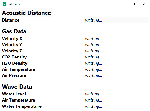
Before the published data arrives, the defaultValue will render as defined for the two otherwise dynamic cells:
After data arrives, the data table will apply the dynamic cell definitions accordingly:
Finally, it’s worth noting that while the plugin provides several colors out-of-the-box which can be assigned (), you may also define custom colors using the customColors configuration. Below we show two custom colors defined for “orange” and “gold”:
    "customColors": {
        "orange": {
            "r": 255,
            "g": 165,
            "b": 0
        },
        "gold": {
            "r": 255,
            "g": 215,
            "b": 0
        }
    }
Configuration Example
Configuration Details
ROOT object
This top level object holds all configuration information for this plugin.
Required: true
Default: (not specified; see any element defaults within)
subscribesTo array
An array of plugin instance names corresponding to plugin instances which will be subscribed to by this plugin instance.
Required: true
subscribesTo[n] string
A plugin instance name (corresponding to a plugin you wish to subscribe to) or a topic published by the worker (ex. __PLUGIN_INFO__).
Required: false
Default: ""
options object
Configuration options specific to this plugin. Note that variables and expressions are generally allowed in this section.
Required: true
Default: (not specified; see any element defaults within)
options.messageSourceKeyNames array
An array of key names to look for when inspecting incoming messages for merge. The first element in this array found as a key name in the Latest Message will be used as the key under which that message will be placed in the Merged Messages object. If no key is found, the message will be placed under a key named "__UNKNOWN_SOURCE__".
Required: true
Default: [
"workerName",
"instanceName"
]
options.messageSourceKeyNames[n] string
A key name to look for when inspecting incoming messages for merge.
Required: false
Default: ""
options.samplePeriod integer
The period in milliseconds at which we compute new values and update the table.
Required: false
Default: 1000
options.computations object
Defines computations to be performed on 1. initialization, 2. on subscription data arrival, and 3. at every sample period just before table values are reevaluated. In general, keys in the sub-objects below become variables in the VAR namespace with their corresponding values. We call these "computation objects". For example, {"myVar": 3, "myRand": "Float:(RAND(0, 10) + 0.5)"} defines variables accessible as @VAR{myVar} with value 3 and @VAR{myRand} with a value equal to a random number between 0.5 and 10.5. As shown in the example, the expression language is allowed here as well.
Required: true
Default: (not specified; see any element defaults within)
options.computations.initializations object
A computation object where keys are JSON paths and values can be of any type and use expressions and functions, and is computed one time when the plugin launches. For example: { "exmapleVar1": 10, "exampleVar2": "kitty" } would make available variables @VAR{exampleVar1} with value 10 and @VAR{exampleVar2} with value "kitty".
Required: true
Default: {
"exmapleVar1": 10,
"exmapleVar2": "kitty"
}
options.computations.initializations.{Valid JSON Set Path} stringnumberbooleanarrayobject
undefined
Required: false
Default: ""
options.computations.subscriptions object
A object where top level keys are plugin instance names corresponding to subscriptions defined in the "subscribeTo" portion of this plugin's configuration, and whose values are computation objects where keys are JSON paths and values can be of any type and use expressions and functions. Under each such computation object, the corresponding subscription data is under a SUB namespace. For example, if subscribesTo was ["Example Publisher"] and Example Publisher was some plugin which published data {"speed": 100, "distance": 1200} then the following would be a valid value here: { "Example Publisher": { "actualSpeed": "Float:( 10 * @SUB{speed} )", "actualDistance": "Float:( 10 * @SUB{distance} )" } }.
Required: true
Default: {
"My Plugin Instance": {}
}
options.computations.subscriptions.{Plugin Instance Name} object
undefined
Required: false
Default: (not specified; see any element defaults within)
options.computations.subscriptions.{Plugin Instance Name}.{Valid JSON Set Path} stringnumberbooleanarrayobject
undefined
Required: false
Default: ""
options.table object
Defines the table attributes, column and row headers (if any), and layout.
Required: true
Default: (not specified; see any element defaults within)
options.table.enable boolean
Whether to enable updates to the table. This may seem like an odd feature (i.e. what's the point of not displaying data) but recall that we could still have logging enabled for this plugin and simply log aggregate data at the specified sampleRate here.
Required: true
Default: true
options.table.showColumnHeaders boolean
Whether to display column headers in the table.
Required: true
Default: true
options.table.showVerticalLines boolean
Whether to display veritcal lines (lines which separate columns) in the table.
Required: true
Default: true
options.table.showHorizontalLines boolean
Whether to display horizontal lines (lines which separate rows) in the table.
Required: true
Default: true
options.table.autoSizeRowHeight boolean
Whether to autosize row heights.
Required: true
Default: true
options.table.columnHeaders array
An array of column headers. Entries here may also optionally append syntax such as (with any subset of the key/value pairs shown) {{{bold=true,italic=true,bgColor=white,textColor=black,width=100,height=50,fontName=Arial,fontSize=15}}} where the colors can be any of the standard colors (black, white, red, lime, blue, yellow, cyan, magenta, silver, gray, maroon, olive, green, purple, teal, navy, transparent) or customColors defined below, the width and height are in pixels, the fontName is a valid installed font, and fontSize is specified in pt. This {{{style}}} syntax will be removed from the string and will not display in the table.
Required: true
options.table.columnHeaders[n] string
A column header. Entries here may also optionally append syntax such as (with any subset of the key/value pairs shown) {{{bold=true,italic=true,bgColor=white,textColor=black,width=100,height=50,fontName=Arial,fontSize=15}}} where the colors can be any of the standard colors (black, white, red, lime, blue, yellow, cyan, magenta, silver, gray, maroon, olive, green, purple, teal, navy, transparent) or customColors defined below, the width and height are in pixels, the fontName is a valid installed font, and fontSize is specified in pt. This {{{style}}} syntax will be removed from the string and will not display in the table.
Required: false
Default: ""
options.table.layout array
A 2D array of strings which defines the layout of the table. Elements in this 2D string array are intepreted either as plain, constant values in the table OR dynamic values which update based on subscription data and computations. To define a dynamic value simply use syntax like ::dynamicValueName:: (this dynamic value name is treated as an ID and must be unique in the table) and then add a corresponding entry in the dynamicValues section of this configuration. Cells may also optionally append syntax such as (with any subset of the key/value pairs shown) {{{bold=true,italic=true,bgColor=white,textColor=black,width=100,height=50,fontName=Arial,fontSize=15}}} where the colors can be any of the standard colors (black, white, red, lime, blue, yellow, cyan, magenta, silver, gray, maroon, olive, green, purple, teal, navy, transparent) or customColors defined below, the width and height are in pixels, the fontName is a valid installed font, and fontSize is specified in pt. This {{{style}}} syntax will be removed from the string and will not display in the table.
Required: true
options.table.layout[n] array
An array of cell definitions for this row in the table.
Required: false
options.table.layout[n].[n] string
A plain constant string to render OR ::dynamicValue:: to apply to this cell in the table. You may also optionally append syntax such as (with any subset of the key/value pairs shown) {{{bold=true,italic=true,bgColor=white,textColor=black,width=100,height=50,fontName=Arial,fontSize=15}}} where the colors can be any of the standard colors (black, white, red, lime, blue, yellow, cyan, magenta, silver, gray, maroon, olive, green, purple, teal, navy, transparent) or customColors defined below, the width and height are in pixels, the fontName is a valid installed font, and fontSize is specified in pt. This {{{style}}} syntax will be removed from the string and will not display in the table.
Required: false
Default: ""
options.table.dynamicCells object
An object where keys are names specified in the "layout" in the format ::dynamicValueName:: and the values are objects containing elements: value, defaultValue, bgColor, and textColor.
Required: true
options.table.dynamicCells.{Dynamic Value ID} object
An object defining the value to display and styling for a cell specified with dynamic value syntax.
Required: false
Default: (not specified; see any element defaults within)
options.table.dynamicCells.{Dynamic Value ID}.value string
A string optionally containing variables and expressions representing the value to display. This is evaluated at the specfied samplePeriod for the table.
Required: true
Default: "@VAR{myData}"
options.table.dynamicCells.{Dynamic Value ID}.defaultValue string
The value to display if/when variables specified in the 'value' are not yet available (i.e. corresponding subscriptions have not yet arrived). This value will also show initially when the table / interface is initialized.
Required: true
Default: "waiting..."
options.table.dynamicCells.{Dynamic Value ID}.bgColor stringnull
A string optionally containing variables and expressions representing the background color to display. The color should be returned as a semantic name such as "red". Valid colors include: black, white, red, lime, blue, yellow, cyan, magenta, silver, gray, maroon, olive, green, purple, teal, navy, transparent, or any color defined in the customColors configuration herein. This is evaluated at the specfied samplePeriod for the table. If this option is set to null, it is ignored.
Required: true
Default: "white"
options.table.dynamicCells.{Dynamic Value ID}.textColor stringnull
A string optionally containing variables and expressions representing the text color to display. The color should be returned as a semantic name such as "red". Valid colors include: black, white, red, lime, blue, yellow, cyan, magenta, silver, gray, maroon, olive, green, purple, teal, navy, transparent, or any color defined in the customColors configuration herein. This is evaluated at the specfied samplePeriod for the table. If this option is set to null, it is ignored.
Required: true
Default: "white"
options.table.customColors object
An object where keys are color names and values are rgb objects. For example we could specify black as: {"r": 0, "g": 0, "b": 0}. Note that the following colors are already available (without having to specify values here in the customColors section): black, white, red, lime, blue, yellow, cyan, magenta, silver, gray, maroon, olive, green, purple, teal, navy.
Required: false
Default: {
"orange": {
"r": 255,
"g": 165,
"b": 0
}
}
options.table.customColors.{Custom Color} object
An object defining an RGB color value.
Required: false
Default: (not specified; see any element defaults within)
options.table.customColors.{Custom Color}.r integer
The red component of the RGB color.
Required: true
Default: 0
options.table.customColors.{Custom Color}.g integer
The green component of the RGB color.
Required: true
Default: 0
options.table.customColors.{Custom Color}.b integer
The blue component of the RGB color.
Required: true
Default: 0
options.logger object
Defines the logging (data and errors) for this plugin. Note that a LOG variable space is provided here, as well as the VAR variable space. Available variables are: @LOG{LOGGERNAME}, @LOG{TIMESTAMP}, @LOG{LOGMESSAGE}, @LOG{ERRORMESSAGE}, and @VAR{instanceName} are available variables. note: @LOG{LOGGERNAME} is equal to the @VAR{instanceName} here.
Required: true
Default: (not specified; see any element defaults within)
options.logger.Enable boolean
Whether to enable the logger.
Required: true
Default: true
options.logger.LogFolder string
The folder in which to write log files.
Required: true
Default: "\\JADE_LOGS\\@VAR{instanceName}"
options.logger.ErrorsOnly boolean
Whether to log only errors.
Required: true
Default: false
options.logger.DiskThrashPeriod integer
The period in milliseconds with which to flush the file buffer to ensure it's committed to the hard drive. Note: This is a performance consideration to prevent writing to disk too frequently.
Required: true
Default: 1000
options.logger.FileSizeLimit integer
The file size at which to create new files.
Required: true
Default: 1000000
options.logger.IgnoreMissingVariableErrors boolean
Whether to ignore missing variable errors when logging.
Required: false
Default: false
options.logger.LogEntryFormat string
The format to use when writing log entries when errors are not present.
Required: true
Default: "\n\n@LOG{LOGMESSAGE}"
options.logger.ErrorLogEntryFormat string
The message format used to construct error log entries.
Required: true
Default: "\n\n@LOG{ERRORMESSAGE}"
panel object
Required: true
Default: (not specified; see any element defaults within)
panel.open boolean
Whether to open the front panel immediately when run.
Required: true
Default: true
panel.state enum (string)
The state in which the window will open.
Required: true
Default: "Standard"
Enum Items: "Standard" | "Hidden" | "Closed" | "Minimized" | "Maximized"
panel.transparency integer
The transparency of the window. 0 = opaque, 100 = invisible.
Required: true
Default: 0
panel.title string
The title of the plugin window when it runs. Note that the variable 'instanceName' is provided here in a VAR variable container.
Required: true
Default: "@VAR{instanceName}"
panel.titleBarVisible boolean
Whether the window title bar is visible.
Required: true
Default: true
panel.makeActive boolean
Whether the window becomes active when opened.
Required: true
Default: false
panel.bringToFront boolean
Whether the window is brought to the front / top of other windows when opened.
Required: true
Default: false
panel.minimizable boolean
Whether the window is minimizable.
Required: true
Default: true
panel.resizable boolean
Whether the window is resizable.
Required: true
Default: true
panel.closeable boolean
Whether the window is closeable.
Required: true
Default: true
panel.closeWhenDone boolean
Whether to close the window when complete.
Required: true
Default: true
panel.center boolean
Whether to center the window when opened. Note: this property overrides the 'position' property.
Required: true
Default: false
panel.position object
The position of the window when opened the first time.
Required: true
Default: (not specified; see any element defaults within)
panel.position.top integer
The vertical position of the window in pixels from the top edge of the viewport. Note: this property is overriden by the 'center' property.
Required: true
Default: 100
panel.position.left integer
The horizontal position of the window in pixels from the left edge of the viewport. Note: this property is overriden by the 'center' property.
Required: true
Default: 100
panel.size object
The size of the window when opened the first time.
Required: false
Default: (not specified; see any element defaults within)
panel.size.width integer
The width of the window in pixels. -1 means use the default width for the panel. Note that depending on panel features exposed, there may be a limit to how small a panel can become.
Required: true
Default: -1
panel.size.height integer
The height of the window in pixels. -1 means use the default height for the panel. Note that depending on panel features exposed, there may be a limit to how small a panel can become.
Required: true
Default: -1
channel object
The communication channel definition used by this plugin. Note: this section rarely needs modifications. In many cases, the underlying plugin implementation depends on at least some of these settings having the values below. Consult with a JADE expert before making changes to this section if you are unfamiliar with the implications of changes to this section.
Required: true
Default: (not specified; see any element defaults within)
channel.SendBreakTimeout integer
The timeout duration in milliseconds to wait for sending messages.
Required: true
Default: 1000
channel.WaitOnBreakTimeout integer
The timeout duration in milliseconds to wait for receiving messages. Note: -1 means wait indefinitely or until shutdown is signalled.
Required: true
Default: -1
channel.WaitOnShutdownTimeout integer
The timeout duration in milliseconds to wait for shutdown acknowledgment.
Required: true
Default: 2000
channel.ThrowTimeoutErrors boolean
Whether to throw timeout errors vs simply returning a boolean indicating whether a timeout occurred.
Required: true
Default: false
channel.ThrowShutdownUnacknowledgedErrors boolean
Whether to throw 'shutdown unacknowledged' errors.
Required: true
Default: true
channel.QueueSize integer
The size of the underlying communication queue in bytes. Note: -1 means unbounded (i.e. grow as needed with available memory).
Required: true
Default: 100
channel.SendBreakEnqueueType enum (string)
The enqueue strategy employed on the underlying queue for standard messages.
Required: true
Default: "LossyEnqueue"
Enum Items: "Enqueue" | "EnqueueAtFront" | "LossyEnqueue" | "LossyEnqueueAtFront"
channel.SendErrorEnqueueType enum (string)
The enqueue strategy employed on the underlying queue for error messages.
Required: true
Default: "LossyEnqueue"
Enum Items: "Enqueue" | "EnqueueAtFront" | "LossyEnqueue" | "LossyEnqueueAtFront"
channel.SendShutdownEnqueueType enum (string)
The enqueue strategy employed on the underlying queue for the shutdown message.
Required: true
Default: "LossyEnqueueAtFront"
Enum Items: "Enqueue" | "EnqueueAtFront" | "LossyEnqueue" | "LossyEnqueueAtFront"
channel.FlushQueueBeforeWaitingOnBreak boolean
Whether to flush the queue upon waiting for new messages (i.e. whether to clear the queue and wait for the next 'new' message; this has the effect of removing old messages and waiting for the next message.
Required: true
Default: false
channel.FlushQueueAfterBreaking boolean
Whether to flush the queue after receiving a new message (i.e. whether to handle the next message coming in the queue and then flush; this has the effect of handling the oldest message (if it exsits) or the next message before flushing the queue.
Required: true
Default: false